Please fill out the form below and we will get back to you as soon as possible.

Blog
How to Choose Interior Paint Colors That Actually Work
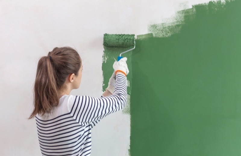
Standing in the paint aisle staring at a thousand nearly identical swatches is enough to make anyone freeze. Choosing interior paint colors feels high-stakes because it is — repainting a room you got wrong is a real hassle. But there's a method to it. Once you understand undertones, lighting, and a couple of simple design rules, you can pick a palette you'll love with far more confidence and far less guesswork.
Start With a Feeling, Then a Direction
Before you obsess over specific shades, decide how you want the room to feel. Calm and restful? Bright and energizing? Cozy and warm? Cool colors like blues and greens tend to feel soothing and recede, making spaces feel larger. Warm colors like terracotta, gold, and warm whites feel inviting and cozy. Naming the mood narrows hundreds of options down to a handful.
Understand Undertones (the Secret to Not Hating Your Color)
Every color, especially neutrals, has an undertone — a subtle hint of another color hiding underneath. A gray can lean blue, green, or purple; a white can lean warm and creamy or cool and stark. Undertones are why a color looks perfect on the swatch and 'off' on your wall.
- Compare a swatch against a pure white card to reveal its true undertone.
- Match undertones to your fixed elements — flooring, countertops, and cabinets.
- Warm undertones pair with warm finishes; cool undertones with cool finishes.
- When in doubt, neutral undertones are the most forgiving.
Tools and Materials You'll Need
- Peel-and-stick paint samples or sample pots
- A foam brush or small roller for sample patches
- White poster board to paint test swatches on
- A pure white index card for undertone comparison
- Painter's tape
- Photos of your room's furniture, flooring, and lighting
How to Test Colors Before You Commit
- Narrow your choices to two or three top contenders.
- Paint a large sample — at least two feet square — directly on the wall or on poster board.
- Place samples on different walls in the room, since light hits each wall differently.
- Observe each color in morning, midday, and evening light, plus under your lamps at night.
- Live with the samples for a few days before making the final call.
- Choose the one that looks good in the most lighting conditions, not just one.
A color you tested for five minutes is a guess. A color you watched for three days is a decision.
Use the 60-30-10 Rule for a Balanced Room
Designers use this simple ratio to keep a color palette balanced: 60% a dominant color (usually your walls), 30% a secondary color (furniture, drapes, large rugs), and 10% an accent color (pillows, art, accessories). Build your wall color around this and the whole room feels intentional rather than chaotic.
Picking the Right Finish (Sheen) for Each Room
- Flat or matte: hides wall imperfections, great for low-traffic bedrooms and ceilings.
- Eggshell: a soft, slightly washable sheen ideal for living rooms and dining rooms.
- Satin: more durable and wipeable, good for hallways and kids' rooms.
- Semi-gloss: stands up to moisture and scrubbing — perfect for kitchens, baths, and trim.
Frequently Asked Questions
How many paint colors should I use in one room?
For most rooms, stick to two or three colors total following the 60-30-10 rule: a dominant wall color, a secondary color, and one accent. Too many competing colors make a space feel busy, while a tight palette feels cohesive and calm.
Why does my paint color look different on the wall than the swatch?
It's almost always lighting and undertones. Small swatches are seen under store lighting and against other colors, while a full wall reflects your room's natural and artificial light. Always test a large sample in your own space across different times of day before deciding.
What are the safest paint colors if I'm nervous about choosing?
Soft, warm neutrals — greige (gray-beige), warm whites, and muted taupes — are the most forgiving and pair with almost any decor. They give you flexibility to change accents later without repainting, which makes them a low-risk starting point.
Rather have a pro handle it?
Get matched with a vetted, insured local pro in about 30 minutes — and track them on the live map.